First few basic question, who are you, what are doing, where are you coming from?
I’m Thomas Schostok aka {ths}, graphic designer, artist and typographer from Germany.
I remember years ago how blown away I was when I first saw your works – your style was/is so beautifully dirty and messed up, how did you started to do what you do? Did it take long to find your own ”style” and the level you were comfortable on?
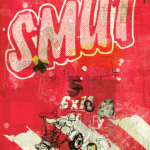
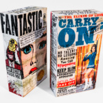
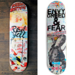
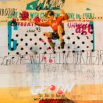
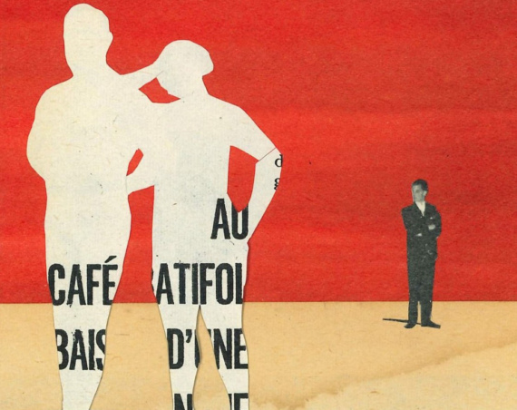
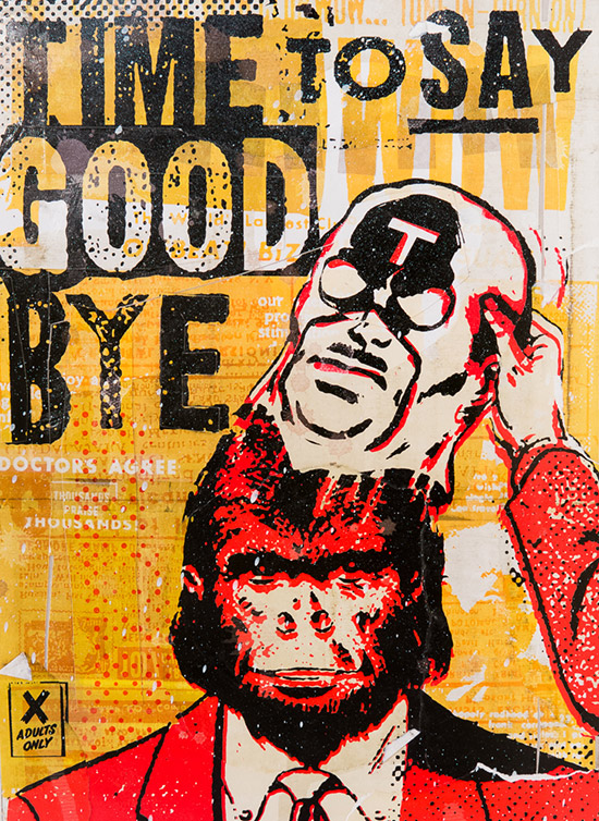
I believe, I had this raw style in my mind as I was a kid. My first memory about “trash” was when I was a kid. I found a small metal toy car somewhere at a playground. Its paintwork was totally cracked and it looked really “trash”, I loved it. Later, my father painted it with color so that it got a new clean look. I believe that every kid would be happy, but to be honest, I hated it.
I believe that was the initial ignition of my style. I’m not sure what was first, typography or that trashy style. Maybe it happens simultaneous. I experimented a lot with an old Fax machine to get that grungy typography and graphics. Nowadays, everyone can buy those Photoshop Actions and grunge textures for a couple of bucks – and gets zero randomness. Synthetic trash. I believe a certain professionalism or let’s say a professional trashy look, takes a long time to produce.
“There is no UNDO. If you glue or spray or paint, then it’s forever.”
It’s not a PSD action/brush, it’s handmade. Thats separate the pro of the amateur. Finding my style got very fast, I think. I love big, David Carson like, typography and I also like a slightly trashy and glitchy style, that will always stay in my work. I speak all about my design work here. I was always struggling when I did art. Mostly it’s a full analog process compared to my design works. In design, I can chose where to place some trash elements or the amount of trash at all. In art, it gets more difficult. There is no UNDO. If you glue or spray or paint, then it’s forever. Lets say, designing is a time machine, where you can go back and change elements. In art, it’s just the present.
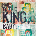
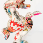
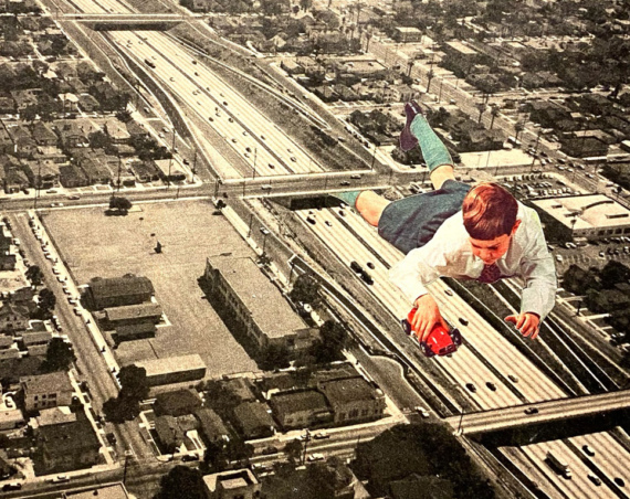
I like to say that my design work influenced or helped to work on my art. That happened a couple of years ago, when I had the feeling that the process of working on art was too slow and unpredictable. Not that I don’t like the randomness, I actually love when things happen by accident. I had the feeling that art could get planed by 90% and the rest would be randomness by the process of work, when glueing or spraying for example. So, from simple sketches on paper, I moved the process of doing sketches to the computer. I have the artwork on computer, more then a sketch, it’s the final artwork, but well, not yet on canvas or paper. The rest 10% is working on canvas, glueing, painting, printing, scratching. This process is most important for me, because I could foolishly print out the sketch on canvas. For me, this feels not right. I miss irregularities when you glue stuff together, when you can see that it’s made by hand.
But I also think that we as artist need to think ahead and to develop. Lately there was an experiment to create a new artwork made by a computer to resemble the work of Rembrandt. The computer analyzed old artworks of Rembrandt and created a new one. Afterwards the artwork was printed out on a 3D-printer. All irregularities of an oil painting was printed too, so that it really looks like a painted artwork. I wonder if that would work with collage or mixed media style too? Printed irregularities of glued paper and spray paint. That’s my dream of doing art.
Beside art you also do commercial graphic and typo designing (Cape Arcona), how your time divides between arts and commercial stuff?
That’s difficult to say, because I think, even by doing 80% commercial stuff, art is always part or influences my commercial work. Lately I worked on three typefaces that I just created for the use in my artworks. The freedom I have in my art also influences most of my commercial work, where I don’t take the given boundaries of a project and just do the way I think it’s the best regardless what the client says. I think a designer should always do something without any boundaries or rules to create the best (creative) possible work – later, it’s time enough to reduce the visuals that the client ask for and that are too creative in the eyes of the client.
You have done so many things during your career, released books, curated Beast -pdf zine, showcased art in various group and solo art shows, been featured and interviewed in magazines and art books just to name few things… So what’s next? What drives you forward?
Boredom. Boredom at what I do, that drives me forward. I want to do things I’ve never done before, and see if it’s fun to do. If I get bored about it or do it too often, I head to the next. That’s probably an important part of the variety of my work. When it comes to designing typo it’s also about the voice in my mind that’s telling me:
“Don’t use an existing font, create your own”.
Lately I started to directing and filming two music videos for Volvopenta, a German band. Directing and filming is somewhat new to me. It’s a new dimension because pictures move, haha, and tell that someone like me, who needs a long time to finish just ONE picture, now you have a lot of pictures per second. Our resources were limited, to say that we had zero budget to do the two movies. The interesting part is, that it just don’t look like something I had done – I have the feeling. It does not looks like {ths}. I found that very refreshing.
In your art works you have a lot of text and you also work with typography, so when you start new piece do the texts follow the visuals or do you build the visuals around the textual idea you have?
Usually I create the visuals first and the text afterwards. There are only a bunch of artworks where a word or a sentence was before I start the visuals. Mostly it’s one or two words then, where I think, this needs to be said or made into an artwork.
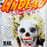
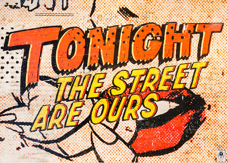
In my art, there where always text. I always had the feeling to „comment” an artwork or to tell a story. A simple image would never tell the whole story to a viewer. From the beginning it was always clear to me to use text as an important part of an artwork.
What’s your personal favorite work?
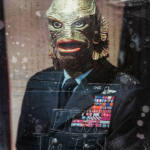
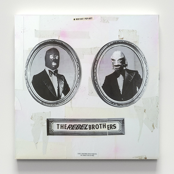
Usually it’s the last artwork I did. But my all time favorite is “The Rebel Brothers” – A monster and a wrestler in tuxedos, man. I mean, that’s crazy.
How critical you are about your works, how easy/hard is to finish your works? During the creating process, is there any singular part where you find yourself struggling often…..
It’s always hard to finish an artwork. I’m never satisfied and I’m always struggling in the process of creation. I’m never sure about and sometimes it tears me apart. Sometimes I need hours and hours for one artwork and I’m mostly just moving one element from the left to the right and back.
Do you observe your development as an artist or in technical execution?
Both. I always try for perfection – even if that is never possible. I need the freedom as an artist but I always head for perfection when it comes to technical execution. I mostly get angry because I think that I had learned to be focused and always know what I want, but I fail, with every artwork, and that’s good. Without failing how would life be?
If you should describe your art with one word, what would it be?
Sticky
THS around the internet:
Homepage: www.ths.nu
Facebook: www.facebook.com/ths.thomasschostok
Twitter: twitter.com/thsnu

